ministry of sound
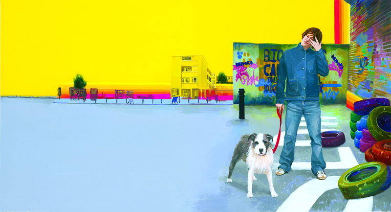
Flesh and Bone
Commissioned for Ministry of sound recordings for the solo act Mankato. Each image was used to wrap around a CD and DVD ( music video), two singles and one album.
I was fully involved from the onset with the concept and feel of the marketing and advertising of the band from the c.d and dvd covers through to the music video, extending the themes created in the images into the narrative of the video. The feel wanted was an imaginative world that felt true to the experiences of the main character ( Mankato ) and the narrative within his lyrics. The colours and imagery would be surreal, with a nod to a drug induced semi- dreamlike state, yellow and red skies, sofas turning into clouds and images from past memories appearing in the present. Working from portrait photos shot by Corinne Day, the rest of the reference photography was shot by myself on location in Hackney for Flesh and Bone, Dungeness and Westboune Park for Safe as Houses, and Notting Hill London for Wasted.
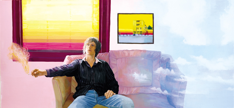
Wasted
It was decided early on that the motif of a rainbow would be repeated in each of the images and that the second and third images would have a reference to the one that went before them.
In Wasted the tower blocks and rainbow from Flesh And Bone are framed in a picture frame above where the artist is sitting. What Mankato is smoking is unclear but a drug reference is definitely alluded to as the sofa he is sitting on is turning into clouds, and the light coming through the window is all colours of the rainbow.
Wasted was particularly successful as a video with the opening scene showing the couch disappearing into the clouds before Mankato goes on his surreal journey.
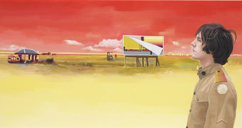
Safe As Houses
The images needed to work together as a set, and include Mankato but each image also needed to be different . Decisions such as colour of the sky and composition was discussed at length with the artist and designer.
Here the references to the other two images are in the billboard, one has been papered over with the other and this one is peeling off to accentuate the theme of time passing yet still existing in the present.
Dungeness was chosen as reference for the imaginary location, as it is somewhere that has an eerie and other wordly feel, the land that time forgot. The character is meant to look in a state of almost meditation he has reached his destination, the journey he set out on is over.
Here are the initial sketches done for the Mankato images above, as you can see their is a large emphasis on colour, with colour combinations used by Bridget Riley a particular inspiration.
The rainbow isn’t mentioned but can be seen running along the horizon in one of the pieces.

