louise
Heineken Magazine
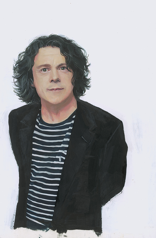
Recent piece for the “Last Orders” article in Heineken Magazine, published by Wardour publishing, who as always were a real pleasure to work with.
They interviews celebrities on a variety of questions and I produce a portrait. Really enjoyed painting this, the dark black of his jacket, hair and the stripy t shirt were a great contrast to the colours in his skin. It’s incredible how much more you notice and learn about a subjects face you’re already very familiar with when you paint their portrait.
RSA Journal
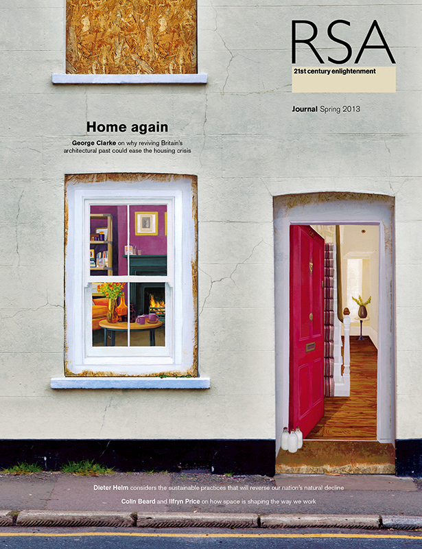
Recent cover done for RSA Journal with Wardour publishing, who as always were a real pleasure to work with
Brief Requirements were
To paint hyper realistically a perfect renovated interior onto chipboard that is boarding up a derelict house in order to create a “trompe l’oeil” effect, this would have to be carefully executed to fit into the space where the old front door would have been. So that the viewer is challenged to ask questions about what they are looking at, and the nature of what is a habitable home. The piece details what is possible with restoration and how we should not ignore renovation of derelict homes as a solution to our housing crisis.
Brief Key Ideas
The image produced should be the opposite of the interior we perceive to be inside a derelict home.. I chose colours that were warm with a bright red front door and an interior that was homely and welcoming to give the greatest contrast to the chipboard.
To show that the room was lived in without showing any people I put three bottles of milk on the front doormat. The interior that I painted would have to be period home that was renovated to the highest specifications to show what is possible, for the house we see that is boarded up in reality .
Mojo Magazine
After a busy patch getting around to posting up recent commissioned work. This was done for Mojo magazine
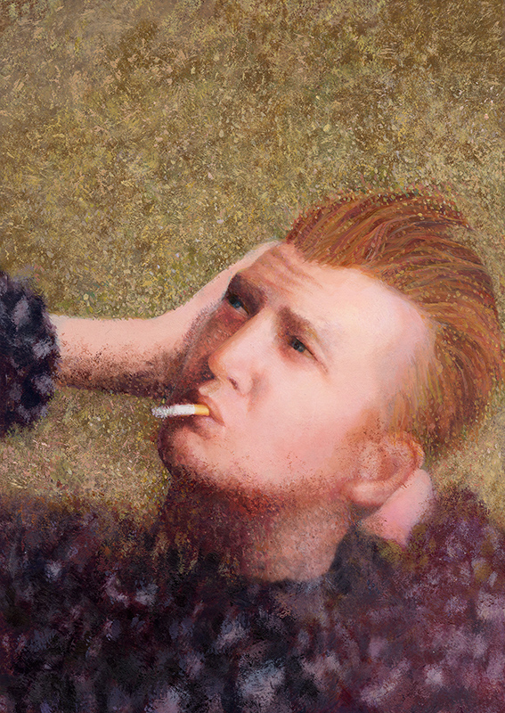
The brief was to produce a portrait of Josh Homme from Queens of The Stone Age in the same pointilistic style and pose of the Hunky Dory album cover by David Bowie. To visually express the points made in the text that their new album has many vocal and production similarities to the David Bowie classic. 
The application of paint had to emulate the filter used to photograph Bowie in the original.
Great to work with Mark Wagstaff and such a thrill to see the copy on the news-stand.
Singin’ In The Rain
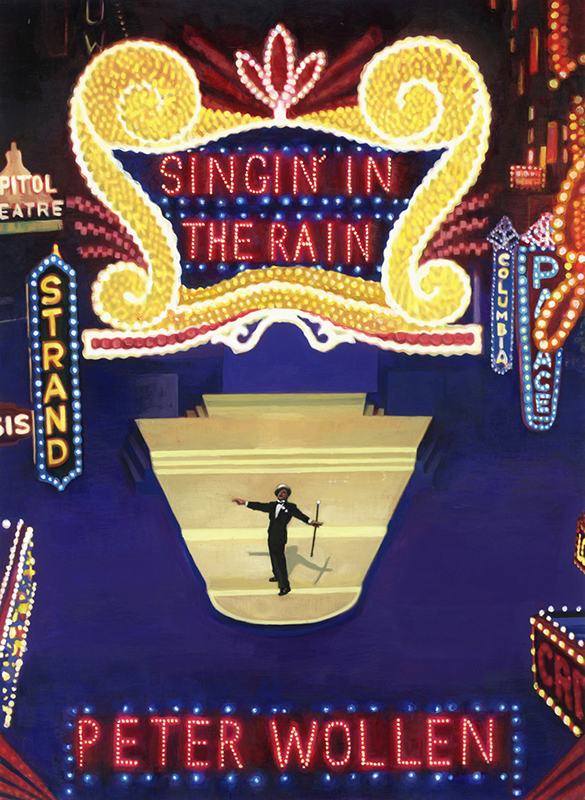
Here’s my cover for Singin’ In the Rain. One of a series of BFI classics released by Palgrave Macmillan. This is now part of the BFI archive.
It was great to work on this project with Sophia Contento, and because the artwork was being exhibited I delivered it round to her flat and she made me a sterling cup of tea. 